Saturday, March 29, 2014

You win some and you lose some

Ok, I am just going to make excuses and say I was a little off my game and blame that this was one of the first projects I did after fracturing my hand. However, we all know that it is just rubbish.  In creating, sometimes we make things that we all get giddy about and cannot wait to share with others.  Then there are creations, that we want to take and hide in a corner and never speak about again.  Well this is one of those creations. 


In my head, I had this wonderful piece all thought out.  I had this little armoire that I had picked up from a thrift store for a whopping .99 cents. So I guess I cannot cry too much.  I decided to alter it finally as I have had it probably for two years.  Oh I had grandiose plans for this one.  It was going to be my masterpiece - lol.  Not even close. 

Road block number 1 - most all of the screws were stripped so getting the doors off was quite a challenge.  Forget taking the hinges off the armoire all together (this plays a part later on).  So I went through with the plan and got the armoire all done.  Not perfect, but decent enough.  Then came putting the doors back on.  Whoops.  I had added so much paint and texture that ones the doors shut....they wouldn't open back up.  Sealed shut I tell you.  So the plan was to get them off and sand them down.  Oops again.  Damaged the doors when taking them off.  They were layered chipboard under all of that - go figure. 

I had two options.  I could through the dang thing in the trash which was where it was headed.  Or find a plan B.  I did want it as a functional item to hold mediums so they weren't just rolling around on the desk.  After stewing for a while and pouting quite profusely, I decided to ditch the doors and leave it open.  Well, there came the next road block - never was able to get the hinges completely off from the inside because of the stripped screws.  Then the incredible hulk moment kicked in and yanked them off.  Amazing what you can do when your determined and little ticked off.   (Normally I am so not this way)

Doors were  off, now to mask my boo boos.  I had to cover the spots where the hinges were (thus the gears in the front)  I don't hate the final piece, it just isn't what I imagined it to be.


Altered Ampersand

I purchased a wooden ampersand from Michael's.  I had seen an idea off of SVG cuts where they did the you and me on it and decided I would use that as inspiration.  It is definitely did not come out anything like theirs, but comes to show how you can get inspiration and make things your own. I had no other plan for it other than knowing I wanted to possibly add a photo to it of Josh and I and hang it in my craft room.

 
Texture.  I love texture.  I covered the entire front and sides in a coat of modeling paste.  I tapped my finger up and down all over to create the texture.  I let dry overnight. You certainly don't need to let it set that long, but I usually don't have much time to craft so sometimes I try to fit the little steps in on a weeknight so I feel like I have accomplished something.  

TIP - for the next step (Read the directions first before using something you haven't done before - LOL)  I have used the modern masters iron paint and rust activator many times so I thought that the copper and patina would be the same (NOPE - lol).  I have a separate tutorial listed under another post. 

Paint with one coat of copper.  Let dry, then paint second coat.  While wet, add patina.  The amount of patina you add will be based on how much of your piece you want to have the patina effect.  The copper paint will eventually patina over time, the patina coat just speeds up the process. 

I stamped with a black script stamp all over to give another layer of visual interest. I used a brown ink bad to edge the piece and hit some of the high points.

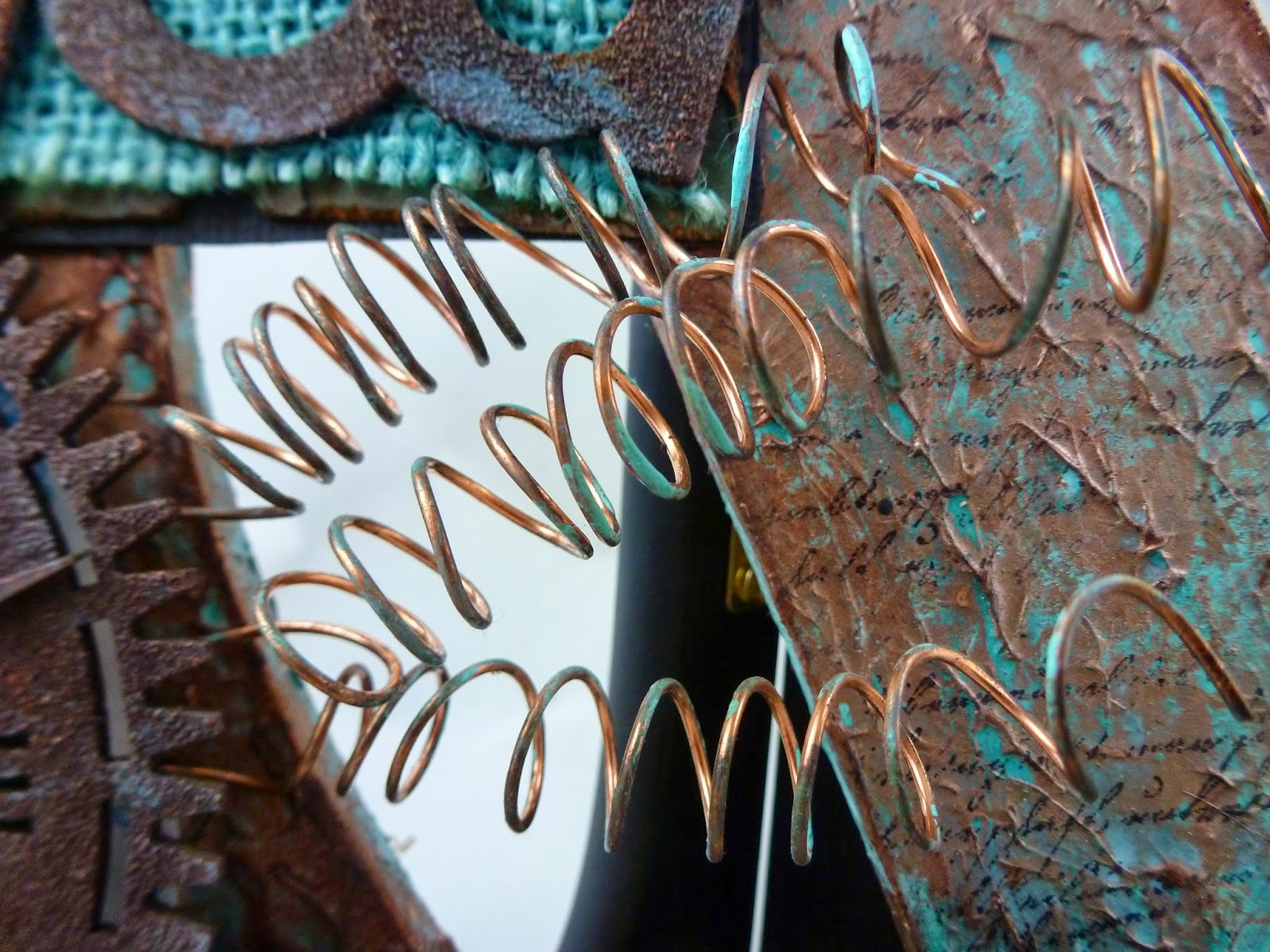
All of that part came easy.  The part I got stuck on was finishing the piece.  I went through about 5 or more sets of letters before deciding on these.  I love how they came out.  Simple too.  Chipboard letters.  Inked brown.  Embossed over the top with TH Vintage Photo distress embossing powder.  Added a little copper and patina gilders paste as highlights.  I layered them onto my mats.  The mats are black cardstock, scrap paper I had distressed, inked and sprayed,  and sprayed burlap.  I finished them up by making copper coils that I beaded and taking a cutesy button paperclip and inking the heck out of it.  

The clock was super fun.  I used a chip board clock and did the same treatments as the letters.  I backed it though with piece of paper that I sprayed with Lindy's Tibetan poppy teal.  The coils are out of 16 gage wire that I wrapped around a paint brush handle then just added a little gilders paste to add a little patina.  I will add the picture as soon as I pick the one I want to display.


Tuesday, March 11, 2014

Assemblage

While I was out of commission, I was able to surf the net.  I came across this site frogdogstudios.com.  They have mixed media kits, so I decided to try a month to see if I liked it.  I ended up getting the February and March regular kits, the March add-on, and a few extra goodies.  One of the items in the March kit was rusting powder by Dusty Attic.  I have to admit I was a bit of a skeptic as I love my rust and I am a faithful user of the Modern Masters Metal Effects Iron Paint and Rusting solution.  I decided to just play with it on some altered altoid tins.  It was very easy and much faster time to prepare than the MM brand.  (Just paint your tin with glue - I used modge podge, sprinkle on the powder, spray with white vinger, and wait 15 minutes).  Easy peasy.  (However, I do not like the smell of the white vinegar and it smelled to me like bad easter eggs).  Well worth the smell though.  The out come was a beautiful rusted piece.

I had rusted the back of the tins as I wanted to see the type of coverage hit had.  I couldn't bear to have it hidden so instead of putting them both open side out, I turned the top one around.  I used the TH Ideology stickers from Lost and Fount , the k letter press block, and the  from the march kit, and the altered domino from the February kit.  From my stash I added the sand, bottle, twine, idealogy metal pieces, shell, and gilder's paste.  I added a little more ink with the prima dark rust ink pad and stamped with the tim holtz honey comb stamp in black randomly around the tin and on the front.  The word strip has rusty hinge distress paint rubbed across the letters to help them stand out.


Monday, March 10, 2014

Altered Art Journal

So here is the First A project - Altered Art Journal. 

I have been wanting to do an art journal for a while.  I will say I have been a little bit intimidated.  I see all of these amazing pages on Pinterest, You Tube, Facebook, etc.  The thing is how do you get better at something....you jump in with both feet and just do.  As we do, we grow in our abilities and just get better with practice.  I have picked up a couple of journals over time and decided that I wanted to focus on the smaller one.  the pages are 5 1/2 x 8 1/2.  I had seen some videos on youtube where France Papillion does it on an 8 1/2 x 11, cuts in half and then puts it into the book.  I figured this would work perfect for me.


Started with a wire bound art journal.  I loosend the rings and slipped off of the covers.  I love that the journal had a texture already to it similar to canvas - bonus.  Painted with gesso and let dry.  Using a lattice and script stencils, I covered most of the surface with embossing paste. I layered on pieces of punchinella and snippets of dry wall tape randomly on the pages.  I cut tons of clock and gear cuts using the silhouette and 65 lb cardstock.  Then painted over the surface with another coat of gesso.


I then sprayed the heck out of the covers with Lindy's sprays.  Of course Tibetan Poppy Teal and Cattail Copper Brown were the main ones.  Then I followed up with gilder's paste, dry brushed with burnt sienna acrylic paint,  then smudged a black ink pad over sections.  


 Finishing touches: Added chunky aged embossing powder around the edges of the book.  Cut a welded title from silhouette 3 times and layered.  Embossed with a square patterned embossing folder.  Embossed in black utee.  Used rust gilder's paste to add color.  I did the same thing with the clock hands.  Layered those with clock gears.  Then I splattered the covers with a bit of black paint. I added dcwv steampunk papers to the inside covers to finish off. 


Sunday, March 9, 2014

I am back - woot woot; Technique Tutorial and a Product Review

Sorry for falling of the face of the earth...well maybe not off the face of the earth - just a two inch step.  I fell 6 weeks ago and ended up fracturing my wrist and leg right below the knee.  So I was pretty much out of commission as far as doing any crafting.  I attempted to do a few things and start a few projects that I could do mostly with my left hand.  Needless to say I didn't get much done.  Finally I have my hand back so I am going to get back to crafting.

I have to say I feel a little lost without having swaps.  Usually I had a direction I needed to go and a deadline.  Yep, I get most of my mojo when I know I am under the wire or have a commitment in place.  Needless to say I have a ton of half done projects, backgrounds sprayed, and ideas floating around but not too much in the completion category.  I think for me, I need to set some goals and my own timelines so that I can be a bit more productive in the time I have to craft. 

One idea I have been bouncing around for a bit, has been crafting my way through the alphabet. I would pick a project, technique, item to use in the project, etc. that began with that letter. I would complete at least one project for each letter.  If the mood strikes, I could always go out of alphabetical order.  I will be utilizing different products and techniques.  In doing so, I am going to be showing some projects, tutorials, techniques, product reviews.  (I have not been provided any products - so this is just all my take on different ones that I can easily find).

I am going to try to post more regularly.  If you think of an interesting project or technique you want me to try for a certain letter, just let me know.

So for an A project I am working on I am doing a copper patina technique.  There are so many ways to achieve a patina look.  Today, I am just focusing on two techniques with paint. 

Technique and Review # 1: 
Modern Masters Metal Effects Copper Paint and Patina Aging Solution
Cost per ounce:  Paint: 11.99 for 8 oz/ $1.50 oz  Patina  $8.25 for 4oz/$2.06 per ounce
Characteristics:  The paint is water based and has actual copper in it.  Since it has actual copper within the paint, it will patina naturally over time.  You can speed up the process by adding the aging solution to the paint.
Ease of Use:  Simple
Directions:  Paint first coat (may need to primer first depending on surface).  Let dry for 1/2 hour. Place on second coat.  While wet, add Patina aging solution.

NOTE:  Trial and error is how we learn.  I am so used to using the rusting solution where you apply all over...my first attempt with this product I applied the aging solution all over.  It wasn't bad, but there was no copper showing any more - it was pure patina blue.    So I would just put the solution on with a brush or sponge onto the areas that you want to speed up the aging process. 

I am in love with the results.....love love love.  The only drawback is that I usually have to order online.   Well worth the money if you are doing a special project.


(The above picture is from a project I am working on and I had put a layer of modeling paste and then tapped my finger all over to create that extra texture).

Technique and Review #2:
Acrylic Paint: Metallic Copper and Patina (You can use any brand - I just used what I had which was the Martha Stewart Metallic Copper and the FolkArt Patina)
Cost per ounce:  You can get the paints anywhere from .50  -  under 2.00 for a 2 oz bottle at Michael's or any craft store.  The price will vary on brand but the cost per ounce will be somewhere under a $1.00 give or take.
Characteristics: Acrylic, dries fast. 
Ease of Use: Simple
Directions:  Paint one color and let dry.  It doesn't matter which color you put down first.  I did it both ways to show a comparison.  Once dry add the second color - let set for just a minute or so.  I wad up a small piece of paper towel.  I like the cheap textured ones as a personal preference and then just dab up some of the extra paint.  The crinkles in the paper towel and the texture in it will give your paint a more unique appearance. 

I do love the results and the paints are easy to find. Due to the size of the bottles, it is an economical choice.

The ME Copper Paint is on the far left, Patina Acrylic Middle, and Copper Acrylic far right


This picture you can see where I painted copper paint over the middle (and had already lifted some up with the paper towel) and then on the right, I painted over the copper with the patina.


The paint color is actually closer to the two above, the larger picture below the two shows better what the texture and overall effect looks like.  Somehow at that angle with the lighting, the colors appear brighter when they are actually more subdued.


There are many ways and products to achieve on different surfaces and I will go through some of those on another tutorial.  However for a quick background on paper - my definite go to is Lindy's Sprays Cattail Copper Brown and Tibetan Poppy Teal.  Just spray and let them run together.   Here is just a sample.


 This was a die cut that I had rusted a while back when I did a batch.  I just threw on one coat of the copper plus patina (not an even coat as I wanted a varied look).  This is what the outcome was - I really like it.


Sunday, January 12, 2014

Tim Holtz January Tag

For the last two years I have been saying I wanted to do Tim Holtz's  12  monthly tags, but never get around to them.  This month, I started off and did his January tag as he displayed the steps and then I did a second one with my own take.  Although I took a simple approach, I do like how it came out and I actually did it. Bonus. 


CANVAS #6 CUTESY

Hello all.  It has been a little while since I posted a canvas.  I am attempting to do small canvases in different styles as part of a private swap I am doing with a friend.  To say I was dreading this style...it would be an understatement.  I had such a difficult time.  First of all, I had done the destash back in September and got rid of everything that could have been remotely used for cutesy or so I thought anyway.  Second, I was drawing a blank.  THANK GOODNESS for GOOD FRIENDS. My friend, Kim, pulled through and sent me this awesome ATC to build this canvas around.

You would think that having the focal point would make doing this canvas so much easier. Not for me.  I ended up doing the canvas 4 times before I got it to the way I could live with it.  Pastels for me are hard to work with, so once I darkened up my palette, it was much easier for me to get past the creative block.  I decided to go with a simple approach as well. 


CANVAS
I went with a simple bright tomato red color    I layered on several G45 papers from the French Country 6 x6 pad. 
 
LAYERS
Using a paper pattern that I free hand cut a paper heart from, I used it to cut the shape out of a pair of old jeans.  Using embroidery floss, I did a sloppy stitch around the border to give it more of a home-spun flair.  I added a piece of adhesive backed Recollections red lace to the middle of the heart. 
 
ATC
Kim sent me this wonderful ATC.  She certainly knows how to make things come to life.  I love all her intricate details including shading and highlighting.  The only changes I made were: I swapped out the orange button for a quilted red heart button I had in my stash and I inked over the top of her inked edges with red. 
 
EMBELLISHMENTS
I decided not to overdo it on the embellishments and went simple.  I used a jewelry finding and strung on the letters BFF with the hearts.  I cannot believe how long I have had those in my stash.  To cover the edges of the finding, I used these little gingham bows that I had received with an order I made last year. 
 
Overall I think the canvas came out pretty well.  Now to choose the next style to work on.